Insurance B2B Platform Redesign
A life insurance company needed to redesign their platform for businesses reselling their products, since the platform was outdated -it was designed in the early 2000’s- and users had reported it was hard to use. Therefore, a new information architecture and modern design was needed.
I worked as Project Manager and primary UX designer, leading a team conformed by a junior UX designer and a UI designer.
I created a new information architecture and designed mid-fidelity interactive wireframes.
Outcomes
The interactive wireframes provided context for the UI designer’s work on the next phase and the client was happy with the redesign.
The wireframes also included a new management feature, so that the client could integrate it in a posterior development phase if needed.
Goals
Creating a new information architecture and redesigning the platform so it would look modern and be effective and helpful for users.
UserS
Middle age to older adults working at resellers of life insurance.
They were owners of small family-businesses or had been working at the reseller companies for decades.
They used this platform to look for information on their clients’ insurance policies and to take action based on their current situation.
Methodology
The client provided their own low fidelity wireframes, but we decided to talk to stakeholders before setting on a design.
A session was conducted with stakeholders to understand different points of view and their insights on the platform usage. As a result, main features and also the ones they knew their users wanted were defined for the scope of the project.
The redesign was carefully discussed with the client given their expertise on the product, to ensure users would get immediate and easy access to the most important features and information.
Deliverable
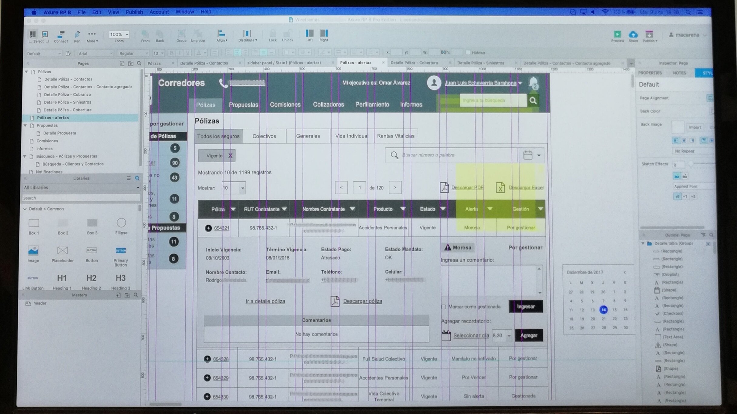
Interactive mid-fidelity wireframes using Axure RP.
I presented the wireframes to the client. This meeting was attended by stakeholders from different departments.
Challenges
Navigation: The original platform was a dashboard in which every clickable link opened a new “system” window. Along with my team, I created a new information architecture.
Overcrowded tables: The primary content consisted of tables with over a dozen columns. Since this new platform was intended to be accessed on mobile phones as well, I had to work closely with the client to reduce the amount of items displayed, leaving the most important in a first view, and adding a “view more” option that displayed less relevant details.
Interface miscommunication: A traffic light color scheme was used to announce items that needed attention, which was the starting point for users. In my design, alerts were kept the same to avoid impacting the learning curve, and titles were added to provide more context. Given their importance, alerts were included as a fix sidebar content.

